Styling CSS grid responsive layouts based on the number of columns on the page

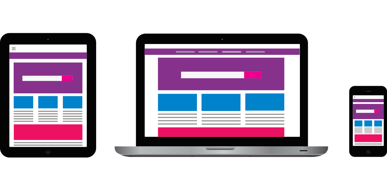
Building responsive layouts using CSS Grid and Flexbox is easy. Few lines of CSS and the columns resize nicely based on the width of the page. CSS Grid or Flexbox takes care of resizing and the columns nicely stack as needed in smaller view ports. We can style these columns using media queries for different browser widths. If we want to add styles based on the number of columns showing on the page though, we need to use JavaScript.

When I was working on converting the Business Directory shortcode to a Gutenberg block, we added options to select the image size. This was a new option which was not in the shortcode. So, the users could choose the number of columns, the image to display (featured image or logo) and the size of the image along with other options while displaying their business directory listings.

They have the option to choose from 1, 2, 3 or 4 column layout or a responsive layout. When it came to styling the images and the text around it, it was not easy. We had to maintain consistency between the specific column layouts and the responsive layout.

The columns in the responsive layouts change based on the width of the page or the content width. We wanted the listings to look consistent in all formats. If the page had only one column, it should show similar to the one column layout, and if the page had 2, 3 or 4 columns, it should show similar to the other column layouts respectively.

This could probably be done using media queries, but it is not easy. The number of columns showing on the page depends on the width of the device and the with of  the page itself, or to be specific, the content width of the page. If we used the Twenty Twenty theme with the default page layout, even on a desktop, the content width is smaller and the number of columns would be different when using the responsive layout.

Business Directory layouts with default and full width pages

Business Directory listings with Twenty Twenty theme using the default layout
Business Directory listings with Twenty Twenty theme using the full width layout

Adding custom classes using JavaScript

To make the styling of the responsive columns easier, I used JavaScript to add specific classes to the responsive columns. gridColumnCount gives us the number of columns being displayed on the page. The outputGridData function adds the desired classes the specific selector. This function is being called when the page loads and also when the browsers is resized. So, the columnCount gets updated when the page width changes.

function getGridData () {
  // calc computed style
const gridComputedStyle = window.getComputedStyle(businesslist);

  return {
    // get number of grid rows
    gridRowCount: gridComputedStyle.getPropertyValue("grid-template-rows").split(" ").length,
    // get number of grid columns
    gridColumnCount: gridComputedStyle.getPropertyValue("grid-template-columns").split(" ").length,
    // get grid row sizes
    gridRowSizes: gridComputedStyle.getPropertyValue("grid-template-rows").split(" ").map(parseFloat),
    // get grid column sizes
    gridColumnSizes: gridComputedStyle.getPropertyValue("grid-template-columns").split(" ").map(parseFloat)
  }
}

window.addEventListener("DOMContentLoaded", outputGridData);
window.addEventListener("resize", outputGridData);

function outputGridData () {
  const gridData = getGridData();
  const columnCount = gridData.gridColumnCount;
  var images = document.querySelectorAll("#businesslist.responsive.cd_block .business .description a");
  //alert(images);
  for (i = 0; i < images.length; ++i) {
    images[i].className = "grid"+columnCount;
  }
}

The code adds the class grid1, grid2 etc to the specific selector. In this case, it is the “a” tag that holds the featured image or the logo. Once the classes are in place, adding styles is simple.

This ensures that no matter the page width, content width or the device width, the layouts will be consistent based on the number of columns being displayed. The image styles are dependent on the number of columns being displayed on the page. If the screen width is 1200px, but only two columns are displayed, images get floated to the left and the content floats around it.

Fun Scrapbook Layout with Gutenberg

Scrap-booking has been my hobby since 2005. It is relaxing and I get to re-live all the fun while putting the pictures together.

I tried a few digital scrapbooks and I loved the ease with which we can put together a page. Adding those digital layouts as part of our blog is easy, but if I want to change something, it is not a simple process.

The new Gutenberg editor now offers ways for us to incorporate cool layouts in our posts and pages. I have been experimenting a lot with Gutenberg lately and I created this simple layout to display some travel pictures of our recent trip.

The Final layout

Simple Gutenberg layout to display images

The above layout requires a few Gutenberg blocks and a little bit of custom CSS. Here is how I built this layout.

Blocks used for the layout

The entire layout is a ‘Group Block’ with a cover block and columns block inside. The columns block has three columns. The cover block holds the big image and the three columns hold the 3 small images.

Group Block Settings

The nice thing about the group block is that we can add a custom background color. I chose the same color as the background color of my site. I added a custom css class to the group block – ‘fun_times_group’ and chose the ‘wide width’ option.

The cover block inside the group block has the main image as the background. The cover block was also set to ‘wide width’ with all other default settings, a solid color overlay with 30% background opacity.

Inside the cover block, I added a heading block and columns block with six columns. For the heading block, I used the ‘Advanced Heading Block‘ form Kadence Blocks plugin. This plugin offers some advanced options for many of the core blocks and some nice to use layouts as well. The advanced heading blocks let me customize the font. The regular heading font coming from the theme is okay, but since this was supposed to be a fun layout, I opted for a fancy font.

The font I used here is the ‘Bad Script’ with font size of 80px and a line height of 87px. The text is center aligned. The rest of the settings were left as default.

Advanced Heading block settings
Advanced Heading block typography settings

The six columns below the cover block are the ones that give the stripes on the big image. I added a custom class to the columns block (the one that is inside the cover block) – ‘top_columns’. Each of these columns has a left border and the last column also has a right border 10px wide. I chose the background color of the group block as the border color for the columns. This shows up nicely as stripes over the image. Everything else is done with CSS. I adjusted the z-index values to show the font over the stripes.

The lower columns block (the one with 3 columns) has the custom class ’tilted_images’. I added an image to to each of the columns and added custom classes to the left and right images – ‘left_image’ and ‘right_image’ respectively. The image tilt is done with the CSS transform property.

Custom CSS

The custom CSS used for the image rotation and the stripes can be added in the Appearance -> Customize -> Custom CSS.

/*Adjust the minimum height, top and bottom margins to get the stripes to span the entire height of the image*/
.top_columns .wp-block-column{
    border-left: #5C5C42 10px solid; /*this is the color of the stripes*/
    min-height: 500px;
    margin-top: -50%;
    margin-bottom: -20%;
    z-index:-10;
}

.top_columns .wp-block-column:last-child{
	border-right:#5C5C42 10px solid; /*This is the last stripe to the right*/
}

/*This moves all the 3 images to the top*/
.fun_times_group .wp-block-columns.tilted_images{
	margin-top:-10%;
}

.tilted_images .wp-block-column{
	z-index:10;
}

.tilted_images .wp-block-image.left_image{
	transform: rotate(-10deg);
}

.tilted_images .wp-block-image.right_image{
	transform: rotate(5deg);
}

Adding custom CSS and JS to your WordPress site

WordPress provides many different ways to customize your site. You can build a custom theme that is unique to your site or you can use an existing theme and tweak it to suit your needs and style.

In all these years of working with WordPress, I have had countless occasions when I had to add a little custom code to the site. If you are a web developer, then this does not seem like an issue at all. You just know where to add the relevant code and you also know how to troubleshoot it if it does not work.

For those of you who are not quite the developers, but would like to have fun with your site, WordPress makes it easy to add code snippets. There are many different ways to add custom CSS or JavaScript to your site. You can use a plugin, or the customizer (only for CSS) or dive into creating a child theme and get your hands dirty with some coding. Whatever method you choose, there are lots of options and good documentation to get you through.

Using the Customizer to add custom CSS:

The Customizer has been part of WordPress for a while now and we have all got used to adding CSS quickly. Go to Appearance -> Customize. In the customizer, there is an option for ‘Additional CSS’. Click on that and add all the CSS you need and save. This is by far the easiest way to add custom CSS to your theme.

This method is good if you need to change or tweak a couple of things on your site. If you want to add CSS for many sections on the site, using a child theme is better.

There is no option to add custom JavaScript in the customizer with the default WordPress theme.  You will have to use some plugins. Some other themes might provide this feature.

Plugins for adding custom CSS and JS

There are a number of plugins that let you add custom code snippets to customize your site.

Custom Header Footer Scripts for Customizer enables you to add scripts to the header and footer of your theme via the customizer.

Simple Custom CSS and JS is my favorite one of all. It makes it very easy to add custom code and has a lot of features even in the free version. It also has options to add custom HTML.

CSS Hero is another plugin that can be used to tweak the CSS of your theme. This premium plugin lets you customize your site live. It gives you an easy interface to edit and see the changes as you are making them.

Using a child theme

There a lot of WordPress themes that you can use to build your site. Each theme gives you certain functionalities along with a certain look/design. If you choose a theme, that gives you the features you want for your site, but would like to change the look and style of it, child themes are best way to do it.

You can use child themes to use the functionality of the parent theme, but change the look and styles of your site. You can add/remove some functionality through the child theme if you like. Creating a child theme requires some knowledge of coding. There are some great tutorials that will guide you though the process of creating a child theme.

Here are some useful links for creating child themes.

Once you have a child theme in place, you can add new CSS and Js files by adding them to the child theme’s functions.php. You need to properly enqueue them.

Nested Grid Layout

I started learning CSS Grid at the end of last year. The more I learn about it, the more exciting it is. CSS Grid makes it very easy to achieve complicated layouts with very minimal CSS. I redid my blog page using CSS Grid a couple of weeks ago and it went much faster than I expected.

Last week, I was working on re-designing the admin page for the Chamber Dashboard business directory plugin and I wanted to do a responsive layout. I needed a sidebar and a right column which in turn needed to have two columns. So, I used nested grids for the layout and it was super simple to get it 100% responsive.

You can take a look at it on CodePen.

See the Pen Nested CSS Grid by Chandrika Guntur (@cguntur) on CodePen.

There is a #main_wrapper div which holds the sidebar and the right column. Here is the CSS for that div:

#main_wrapper{
display:grid;
grid-template-columns: repeat(auto-fill, minmax(350px, 1fr) );
grid-gap: 3%;
}

Using the autofill and minmax makes the grid 100% responsive. Here is more information on this https://rachelandrew.co.uk/archives/2016/04/12/flexible-sized-grids-with-auto-fill-and-minmax/

In the right column, there are multiple divs which are also displayed in a grid. Here is the CSS for the right column:

.inner_wrapper{
display:grid;
}

I needed the sidebar to take up 1/4th of the width and the right column to take up 3/4ths of the width when the screen width is above 700px. The divs in the right column should in turn be 2/3rds (left div) and 1/3rd (right div). Here is the code that does that.

@media screen and (min-width:700px){
.inner_wrapper{
grid-template-columns: 2fr 1fr;
}

#main_wrapper{
grid-template-columns: 1fr 3fr;
}
}

‘fr’ is the fractional unit. Learn more about the fractional unit here:

https://css-tricks.com/introduction-fr-css-unit/

https://alligator.io/css/css-grid-layout-fr-unit/

The div’s 1 & 2 are divided into two columns each, but the 3rd div should again be one column. So, I added a class one_col to the 3rd div. The CSS below makes sure that the 3rd column would stretch the entire width:

.inner_wrapper.one_col{
grid-template-columns: 1fr;
}

Here is the screenshot of the actual page.

CSS responsive nested grid layout

Here is the plugin admin page screen cast showing the responsive grid in action.

If you would like to learn more about CSS Grid, here are some resources:

https://gridbyexample.com/

https://abookapart.com/products/get-ready-for-css-grid-layout

https://css-tricks.com/snippets/css/complete-guide-grid/

WordPress blog page template with CSS Grid

CSS Grid is a very easy way of defining page layouts in two dimensions. I designed my site almost an year and half ago using Bootstrap. I have been planning to re-do the entire site using CSS grid, but it has been very difficult to set aside time to work on my site. So, finally this past weekend, I spent some time to re-do my blog page template using CSS grid.  It was much easier than I expected.

Why do I want to change from the bootstrap (most popular) framework to CSS grid? CSS grid is a much simpler way of achieving the same layout. It also gives you more flexibility with responsive sites. Here is a very nice article that explains this difference between Bootstrap and CSS Grid – https://hackernoon.com/how-css-grid-beats-bootstrap-85d5881cf163

So, coming back to my blog page, I wanted a full width responsive page with 3 posts across without a sidebar.  You can see the responsive grid layout here.

Here is the code to display my posts in a grid:

&lt;section class="blog_posts"&gt;
&lt;?php if ( have_posts() ) : 
         	// Start the loop.
            while ( have_posts() ) : the_post();
		?&gt;
            &lt;article class="single_post"&gt;
		&lt;div class="featured_image"&gt;
			&lt;?php
				if ( has_post_thumbnail() ) {
					the_post_thumbnail( 'full', array( 'class'  =&gt; 'bck_img' ) );
				}
			?&gt;
		 &lt;/div&gt;
                &lt;div class="title"&gt;
                    &lt;h2 class="page-title blog screen-reader-text"&gt;&lt;a href="&lt;?php the_permalink(); ?&gt;"&gt;&lt;?php the_title(); ?&gt;&lt;/a&gt;&lt;/h2&gt;
                 &lt;/div&gt;
                          &lt;/article&gt;&lt;!--end of single_post--&gt;
             &lt;?php
           // End the loop.
           endwhile;

            endif;
            ?&gt;
    &lt;/section&gt;&lt;!--end of blog_posts--&gt;
	&lt;?php posts_nav_link(); ?&gt;

Here is the CSS for the grid:

.blog_posts {
display: grid;
grid-template-columns: repeat(auto-fill, minmax(350px, 1fr));
grid-gap: 30px;
}

grid-template-columns: repeat(auto-fill, minmax(350px, 1fr)); -> this makes the grid responsive. I have included a few links at the bottom of the post that explains responsive css grids.

Here is the entire blog page template.

&lt;?php
    //Template: Blog Page
?&gt;
&lt;?php get_header(); ?&gt;

&lt;div class="container"&gt;
&lt;section class="blog_posts"&gt;
&lt;?php if ( have_posts() ) : 
         	// Start the loop.
            while ( have_posts() ) : the_post();
		?&gt;
            &lt;article class="single_post"&gt;
		&lt;div class="featured_image"&gt;
			&lt;?php
				if ( has_post_thumbnail() ) {
					the_post_thumbnail( 'full', array( 'class'  =&gt; 'bck_img' ) );
				}
			?&gt;
		 &lt;/div&gt;
                &lt;div class="title"&gt;
                    &lt;h2 class="page-title blog screen-reader-text"&gt;&lt;a href="&lt;?php the_permalink(); ?&gt;"&gt;&lt;?php the_title(); ?&gt;&lt;/a&gt;&lt;/h2&gt;
                 &lt;/div&gt;
                          &lt;/article&gt;&lt;!--end of single_post--&gt;
             &lt;?php
           // End the loop.
           endwhile;

            endif;
            ?&gt;
    &lt;/section&gt;&lt;!--end of blog_posts--&gt;
	&lt;?php posts_nav_link(); ?&gt;

&lt;/div&gt;&lt;!--end of container--&gt;
&lt;?php get_footer(); ?&gt;

Here are some links for learning CSS grid.

https://developer.mozilla.org/en-US/docs/Web/CSS/CSS_Grid_Layout/Basic_Concepts_of_Grid_Layout

A complete guide to CSS grid

Some CSS Grid collections from codepen – https://codepen.io/search/collections/?q=css%20grid

Get tips and tutorials on using the new block editor, WordPress themes and plugins!

Aligning check boxes vertically in IE using CSS

I just finished working on a project and while I was in the final testing phase, I realized that there were some check boxes in a form that were not displaying correctly in IE. I found a few answers on Google but, these did not fit to my CSS styling properties and I needed a quick fix without redoing a bunch of CSS.

So, I came up with a simple solution of adding a class to the check boxes.

Here is the my form. Just a list of the days of the week. I need them to display one below the other.

<form id=”stylized” name=”email_reminders” method=”post”>
<label for=”repeat_sunday”>Repeat:</label>
<input type=”checkbox” name=”repeat_sunday” value=”1″ />Sunday<br />

<label for=”repeat_monday”>&nbsp;</label>
<input type=”checkbox” name=”repeat_monday” value=”2″ />Monday<br />

<label for=”repeat_tuesday”>&nbsp;</label>
<input type=”checkbox” name=”repeat_tuesday” value=”3″ />Tuesday<br />

<label for=”repeat_wednesday”>&nbsp;</label>
<input type=”checkbox” name=”repeat_wednesday” value=”4″ />Wednesday<br />

<label for=”repeat_thursday”>&nbsp;</label>
<input type=”checkbox” name=”repeat_thursday” value=”5″ />Thursday<br />

<label for=”repeat_friday”>&nbsp;</label>
<input type=”checkbox” name=”repeat_friday” value=”6″  />Friday<br />

<label for=”repeat_saturday”>&nbsp;</label>
<input type=”checkbox” name=”repeat_saturday” value=”7″ />Saturday<br />

</form>


Continue reading “Aligning check boxes vertically in IE using CSS”

CSS vs Tables

The other day, my husband and I had an argument over CSS and Table based layouts for web pages. His point was that tables are more easier to predict and give a structure to the website where as with CSS it is rather difficult to achieve this. I think it is true to some extent. I used to design websites with tables before I learnt CSS. Now, I don’t think I would ever go back to table layouts entirely.  Here are some reasons why CSS based layouts are better.

File Size:

The file size with CSS based layouts is smaller which helps in faster loading of the site. Table based layouts have a lot more tags that result in a larger file size.  It has been found that CSS based layouts usually load 2-4 times faster than table based layouts.  It also takes up less bandwidth. Some hosting providers charge based on the amount of bandwidth used. So, using CSS layouts helps lower those costs especially if it is a large site. Patrick Burt has some good suggestions to reduce file sizes with CSS.

Cheaper and faster redesign:

In CSS based design, the content of the website is separated from its visual appearance. External style sheets Continue reading “CSS vs Tables”

Verified by MonsterInsights