Food Blog layout using the block editor

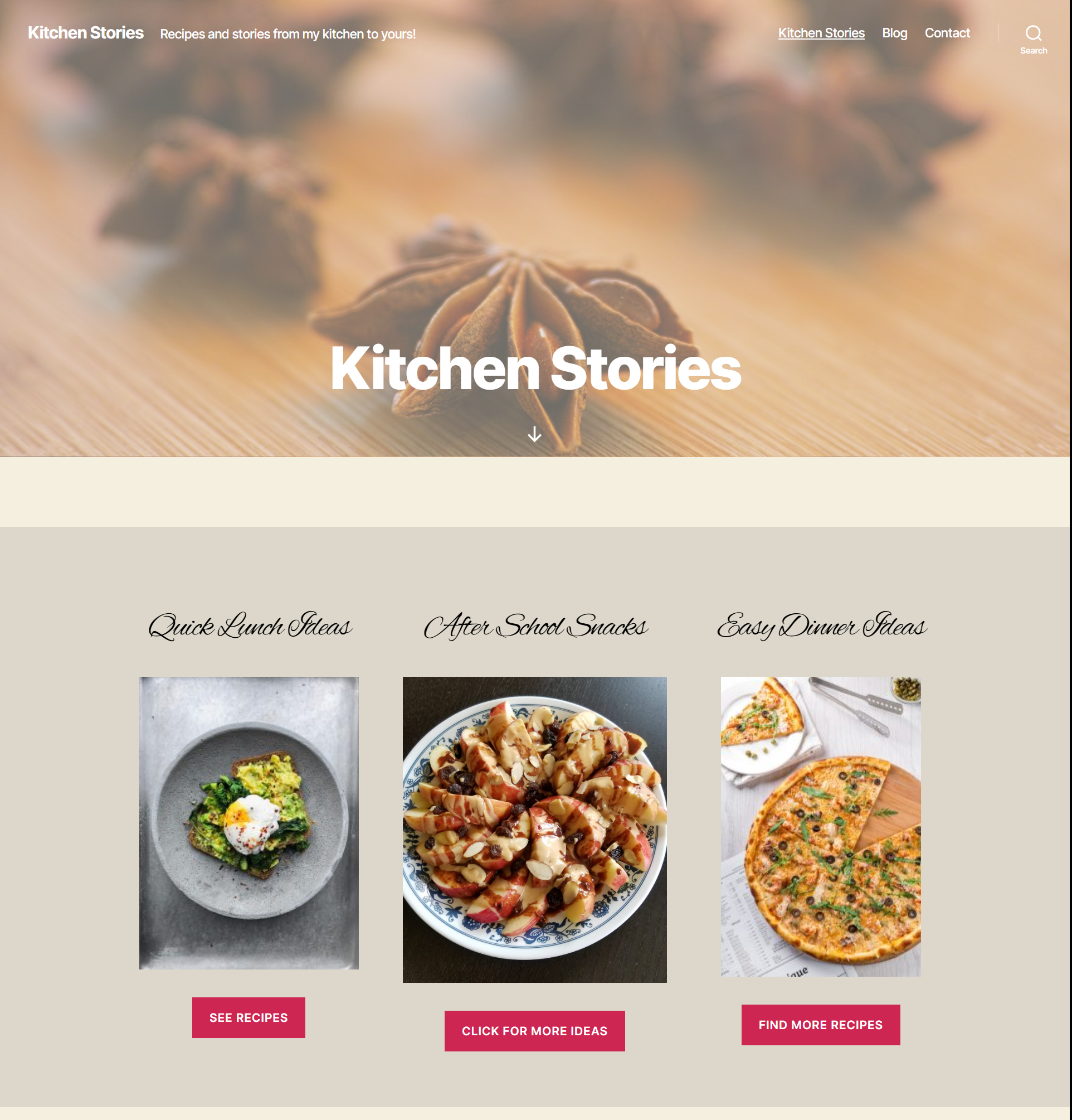
This food blog home page layout is a simple layout that works well for the home page of a food blog.

This has been put together using the TwentyTwenty theme and the block editor. TwentyTwenty is the default WordPress theme and has awesome support for the block editor.

Food blog layout with Gutenberg blocks
Food blog layout (click on the image to see the entire page layout)

The layout has multiple blocks that include some of the core WordPress blocks and some blocks from other block plugins.

The colors in this layout are very neutral and help bring out the vibrant colors of the recipe images.

Click on the image to see the entire page layout.

Blocks used for this layout

Header image using the TwentyTwenty theme cover page layout.

The “Cover Template” from the TwentyTwenty theme was used for this page. The header image is the featured image added to the page. The overlay color is set in the theme custom settings by going to Appearance->Customize.

The background color of the page can also be set in the customizer.

Category sections

The next section was created by using a group block that contains 3 columns, created using the columns block. The group block has a different background color than the page background which makes it stand out in contrast.

Each column has an “Advanced Heading” block from Kadence blocks plugin, an image block and a button block.

Category sections group block for the food blog layout.

The advanced heading block provides options to set a custom font (font family) along with font size and line height. The font I used for the heading here is ‘Alex Brush’ which is a Google Font. This block also provides various other options like text-shadow and margins. Although the layout shown here does not have a text-shadow or a margin, it is easy to add them.

The buttons in this block can link to recipe categories like lunch, snack etc. This would be an easy way for the visitors to find what they need. Usually, when a visitor comes to a food blog, it is through a specific recipe link, but if they do land on the home page, this is an ideal way to send them to browse more recipes.

Media and text block - food blog layout

Call to action block – using the Media&Text block

The cooking workshops section was created using a Media&Text. The media part of the block can have an image or a video and the text part of the block can have multiple blocks if needed.

The text part of the block here shows and ‘Advanced Heading’ block from Kadence blocks, paragraph and button blocks. The heading has the same font as the section above it.

The button here is a call to action button that can be linked to a page. This block is ideal for a prize giveaway or as a link to your cooking videos. Save this block as a reusable block and use on other pages easily.

Latest Posts Block

The latest blog posts section is another group block with an ‘Advanced Heading’ block and a ‘Posts’ block from Stackable blocks plugin.

The block here displays the posts from the food category. If you add this layout to your page, make sure to select a category for the posts here.

Latest posts block as a group in the food blog layout

The advanced heading is similar to the other heading blocks and uses the same font.

The Posts block from Stackable, has more options compared to the ‘Latest Posts’ block.

Email subscription block for the food blog layout

Email Subscription Block

The email subscription block uses columns with a paragraph block on the left and an email newsletter block from ‘Atomic Blocks’ on the right.

Atomic blocks provides with an email newsletter block that is connected to Mailchimp. To use this block, you need to connect your Mailchimp account by saving the api key in the plugin settings.

You can select the Mailchimp list when you add the block to the page.

The footer has space to add widgets. The search widget was added to the left and the on the right side is an image gallery of the featured images of the recipe posts. These images are linked to the posts.

Footer layout using the TwentyTwenty theme.

Adding this layout to your site

Modify this layout easily to match your site’s colors and fonts. You can download the code and add it to your page. Just copy the code and paste it into the code editor of your page.

If you are not sure about how to add the layout code to your page, view the video below.

Make sure you have all the necessary block plugins required for this layout to work. This layout uses blocks from Kadence Blocks, Atomic Blocks and Stackable along with the core WordPress blocks.

Importance of strong online presence for small businesses

A couple of weeks ago, on our way back from the beach, we decided to go to an Indian restaurant for dinner. We wanted to try a new place. So, I started googling for restaurants near us and started checking out the ones that we could try. I wanted to check out their menu to see if they had a particular dish that my kids wanted to have. To my surprise, two or three of them did not have a website and even if they did, they did not have a proper menu.

This made me think why wouldn’t somebody who is doing business, not have a proper website? In this day and age, a website is very important for the success of your business. It can make or break a business.

Let’s take the example of restaurants. If they have a website with their menu and hours on it, it would be helpful to a lot of people. People are in a rush trying to find things quickly. People use ‘Siri’ and Google to find things online. If you do not have an online presence, they will not find you. You need to optimize your site to show up in the “near me” searches. Having your business address registered in Google search is not enough. You need to have a website and at least a couple of social media profiles that talk about you and your business.

Wider Audience

Having an online presence helps you gain wider audience. Your website is accessible to people around the world. You might think that your products/services are local, but never underestimate the power of the web. Even if it is local, your site will help you gain more customers. People usually tend to search for products and services online first. Even if you don’t sell anything online, your potential customers will checkout your site and if they like what they see, they might actually come to the store to buy the products or contact you for your services.

Website accessible at all times

Your website is accessible to people even when your office/store is closed. People don’t have the time to go and visit different stores before buying a product. Many of them prefer online shopping in the comfort of their homes. So, having a website means that your will show up as an option for your potential clients.  Some services cannot be bought online and in that case give your potential clients a chance to read about you and get to know you. That will make it easy for them to make the decision to hire you.

One of the reasons people ignore their websites and social media is because they do not know where to start. There is so much information thrown towards us, that we are utterly confused on what is important. 

Here are the three main things a business needs to thrive online. These are just the starters, but can quickly evolve into much more. 

  1. A website
  2. Social media presence
  3. Strong SEO

Websites

Setting up a website is one of the easiest things and also one of the first things you should do. Here are the things you need to setup a site:

  1. Domain Name 
    As soon as you decide on your business name, check if you can purchase a domain name the same as your business. If your business name is a unique one, then it should be easy. You can do a search for domain names easily – https://www.name.com/domain/search
  2. Hosting 
    Once you have the domain name, purchase a hosting account to host your website. You can find some good hosting options here. I use SiteGround for my site and recommend it for my clients as well. Their customer service is excellent. You can check out Site Ground’s hosting options here.
  3. CMS 
    Using a Content Management System like WordPress will make it easier to add new content and maintain your site in the long term. Although WordPress is easy, there might be a learning curve. Once you install WordPress on your site, you can add pages and content to your site. There will be some options to customize your site. You now have a brand new site that you can show off to the world!! 
  4. Design for your site: WordPress comes with a number of themes to choose from for the look of your site on the front end.  You can choose a free theme and setup your site. If you want a custom design for your site, you will need to hire a professional to help you with the design and the building of the theme. Here are some tips to choosing the right theme for your WordPress site.

Building a website isn’t rocket science, but there are some things to keep in mind while you are building or setting up your site.

Websites make lasting impressions on people. You have a few minutes to make them interested in your products/services. So, you should make sure that your brand value/personality shows through your website. That will help people make the connection between you, your products/services and your website. Make the website easy to use and have the information easily accessible.

Your website should speak about you and your business just like you would in person. Your website is one of the best resources you have to convince users to purchase your products/services.

How much do I spend on my website?

So, now the big question that bothers every small business owner – How much should I spend on my website? Unfortunately, there is no magic number anybody can give you. You have to figure it out based on your requirements.

The good news is that you do not need to put down an enormous amount for a starter website. 

Just like you would not start a company with 10,000 employees on day 1, you do not need an expensive website with all the bells and whistles to get started. You can have a starter website for about $2,000.00. As your business grows, you can add more features to your site.

Does my website need a re-design?

Social Media

Social media is as important as a website. People like to engage and get updates and information through their Facebook, Twitter, Instagram and other social media accounts. Having these for your business will definitely increase your customer base and result in more sales. Social media channels are a place where you can interact with your clients.

You do not need to have a profile on every social media channel out there. Some social media are preferable for some businesses. Facebook and Twitter are generally relevant to all businesses. There are other social media channels like Instagram, YouTube, LinkedIn, Pinterest etc which you should definitely look into.

Post about product updates, offers, new products etc on your social media. Make it so that your potential customers are guided back to your website from all the social media channels.

SEO

Search Engine Optimization ensures that your site will show up on major search engines. Most people end up on a site from search engines. If your site does not show up in a search, it is very likely that you won’t be found on the internet. 

SEO is an ongoing process. You have to keep working on it to make sure your site shows up for relevant searches. If you use WordPress, there are a number of free plugins that will help you with SEO. I use the Yoast SEO plugin which offers a number of options even in the free version.

You can dedicate entire days for your SEO and there will be still so much more you can do. But, since you also need to focus on your business, you can start with a few things and learn as you go.

  • Add your site to the Google Search Console and the Bing webmaster tools. The webmaster tools help you see how your site is showing up on search engines, how your pages are ranking and what search phrases or words are people using to land on your pages. You can use the free Yoast SEO plugin for this.
  • Add an XML sitemap. XML sitemap is like a table of contents for your site. This helps search engines crawl all the pages on your site more efficiently. Sitemaps also include information about when the pages have been updated and the meta data of the pages.
  • Make sure your pages are loading quickly. If you have great content on your site, but it takes forever for your pages to load, people will quickly leave the site.
  • Have a mobile friendly site. Most of the website traffic these days comes from mobile phones and tablets. So, making your site mobile friendly is very important.
  • Optimize your page content and images – There is a lot you can do to optimize the content of your pages. Get started by having a title and description for your pages. This can be done using the Yoast SEO plugin if you are using WordPress. Adding descriptions to images using the alt tags and optimizing the image sizes helps.

There is a lot more you can do to have a strong online presence for your business. Get started with the minimum and add as you build your business online.

Get tips and tutorials on using the new block editor, WordPress themes and plugins!

Gutenberg Page Layouts

Gutenberg has made building page layouts really easy. There are a number of advantages of the block editor. Here I am going to focus more on the types of blocks available to build beautiful page layouts.

The core blocks are in themselves enough to build page layouts without depending on the theme templates. The block plugins however, provide not only additional blocks, but also enhanced versions of some of the core blocks.

Useful blocks for building simple page layouts

Given the number of blocks available, it can be sometimes overwhelming when you are working on your pages.

Here are some blocks that are simple, easy to use and can help us build some nice layouts.

The gallery block from the core blocks provides a number of options to create beautiful galleries. If you are a blogger, or have a photography site, you can use these gallery blocks to display your beautiful pictures with as few words as you like.

Tiled Gallery
Tiled Gallery Block
Slideshow Gallery
Slideshow Gallery Block
Gallery block from Kadence blocks

Cover Block

This is one of my favorite blocks. I remember the days when I struggled to display a banner on the home page for my clients, where the text had to sit on top of the image perfectly centered and responsive. With the cover block, all of this is possible with a few clicks. This block is part of the core blocks and makes it a breeze to add an image with an overlay, text and a call to action button.

The nice thing about the cover block is that, you can use it in any part of your site, not just as a banner on your home page. You can add a call to action button using a cover block as part of a promotional post you write. You can save this and use it in multiple places through out the site.

The core cover block provides only a few options, but is easy and simple to use. The simplicity is what makes it super easy and quick to setup.

Cover block example
Another cover blcok example

Group/Container Block:

The group/container blocks can have multiple blocks inside them. They are all held together by this one background block. You can add a background color/image to the entire set of blocks and also save it as a reusable block.

These blocks make it simple enough to create layouts using columns and buttons, which previously required the use of theme templates.

The group block – which is part of the core blocks, only gives us the option to add a background color or a gradient. The container blocks from other block plugins are similar to the group block and have more options to customize along with the ability to add an image or a video as the background.

Use these blocks to make your site more personal and aligned with your branding.

Container block from Stackable

Media & Text Block

This is one of the easiest blocks to create beautiful layouts. This block makes it easy to add an image/video and some text next to each other, without having to worry about alignment, margins, padding etc. My favorite feature of this block is the ability to flip the placing of the media and the text horizontally.

The text block is actually more than just a text block. You can add any other block inside the text block. You can add a simple heading, a column block or any other block to go with the image/video.

Media & Text Blocks

Page layouts

Most of these layouts do not have any additional CSS. Although we can build custom page layouts using any WP theme, Gutenberg ready themes make it even more easy to build pages with the block editor.

Portfolio Layout

Here is a portfolio layout using only the column and the image blocks. I created a simple template to display my portfolio on this site. I wanted to replicate that page using Gutenberg. It was very simple and easy. With this new layout, it is easy to switch the portfolio pieces and arrange them anyway I want.

Portfolio Layout with Gutenberg - Front end
Portfolio Layout using Gutenberg
Portfolio layout with Gutenberg - back end
Portfolio edit screen

The post edit screen and the front end page look very similar. This makes it very easy to visualize the page layout while you are building the page. 

Similar layouts can be built using the “Feature Grid” block from Stackable or the “Post Grid” block from, the Ultimate Addons block plugin.

About page

The profile page layout in the Atomic blocks plugins is easy to use and can be added with a single click. You can modify the text and images as needed. This provides an easy way to build a profile page or an about page in just a few minutes.

Product Page Layout

This is also from Atomic blocks’ layouts. This layout can be used as is by just changing the text and images, or can be modified to match your branding and site colors.

Simple layouts using the column blocks

The resume page layout was created using columns of different widths. This layout was built using only the core blocks like the heading, paragraph and the list blocks.

Resume Layout using column Blocks

The “Plan Your Trip” part of this page is also built using columns.

Column blocks used to build a section of a page

Post Layouts

Displaying custom post types is more easier than ever with all the different types of post type blocks available from the different block plugins. This is one feature I feel is missing from the core blocks. We can show the latest posts which are the main blog posts of the site., but if we need to display custom post types, we need a different plugin.

Fortunately, there are a number of different post layout blocks available for us to choose from. Here is a custom posts layout using the “Posts Grid” block from Caxton Blocks.

Webpage layout using the Hestia theme

This simple layout was built using the Hestia theme. Core blocks and a few blocks from block plugins were used to build this layout.

251

Webpage layout using the TwentyTwenty theme

This is also a simple and easy layout built with core blocks and blocks from Stackable. Read more about this layout here.

Get tips and tutorials on using the new block editor, WordPress themes and plugins!

WordPress 5.0 & Gutenberg – Is your site ready?

WordPress is used to power many small businesses because it is relatively simple to set up and use. Once you have proper systems in place, WordPress makes it very easy for you to run your business.

If you are a small business owner, I am sure you use your website to let the world know about your products or services, generate leads, keep in touch with your customers and a whole lot more. You entire business depends on your website.

So, it goes without saying that keeping your website up and running the latest versions of WordPress core, themes and plugins is extremely important. But, we may just have to break that rule when the new WordPress 5.0 comes out.

WordPress 5.0 has been scheduled for release on Nov 19th, which is just around the corner. This is one of the most important versions as Gutenberg – the new editor is being integrated into the core. As always new versions of WordPress bring in a bunch of new features. This time though WordPress is getting a major overhaul with the addition of Gutenberg.

If you have been using WordPress, and having been keeping up with the news, you probably heard about Gutenberg and have already tested on your site. Some users love Gutenberg and others just don’t like it. If you haven’t paid attention to it or tried it yet, now is a good time to do so.

Why do we need to be cautious about this update?

Gutenberg has drastically changed the WordPress editor interface and it is coming into core faster than we would like. Everything is different and it will be a while before everyone is on board and gets comfortable with it. 

Gutenberg Editor

As nice as Gutenberg is, it might not work with all the plugins or the theme on your site. I know that many plugins and themes are now  Gutenberg compatible, but there might be some which are not yet compatible with the new editor. 

If you are not sure, it is probably best not to update to the new version just yet. Stay on the 4.9.8 version until you are sure your site works well with the new editor.

One more reason to stay with the old version is that 5.0 is scheduled to be released right before the holiday season and specifically the week of Thanksgiving. If you have online sales, it might be a good idea to wait until after the holiday season to update. You do not need to be stressed about your website when you should be focusing on the holiday sales!

What can we do for a smooth transition?

There are many things that you can do in order to make sure that you site is ready for Gutenberg.

  • The first thing is to test. If you haven’t done so, please test. There is an easy way to install Gutenberg from your dashboard. Please make sure you test it before the WP 5.0 comes out. 
Install Gutenberg from WordPress dashboard
  • Installing Gutenberg on a live site should not be an issue at this point. I am using Gutenberg to write this post. If you have a lot of plugins and are not comfortable installing on a live site, create a staging site to test. 
  • Try to create posts and pages using Gutenberg. 
  • Check your posts, pages, forms, page builder layouts (if you are using any), custom fields, SEO fields etc.
  • If there are multiple people managing the back end, make sure everybody has a chance to test Gutenberg and that they are on board. 
  • If a plugin or theme is not compatible with Gutenberg, contact the theme or plugin developer and ask for help.
  • If you have a web developer maintaining your site, contact them to ask if they have a plan in place for when the new WP version comes out.
  • If you are not comfortable with the new editor or if any of the plugins are not working with Gutenberg, you can install the classic editor plugin.
  • In fact I would recommend installing the classic editor anyway so that if you have issues with the new editor or if it is just overwhelming, you can just use the classic editor which is familiar. This will help you make a smooth transition.
  • If you are on managed hosting, please find out if the auto update is on. If you do not want to update to the new version right away, ask your hosting if they can turn off the auto update feature for WordPress 5.0.
  • When WP 5.0 is released, you can use a staging site to test it out before updating it on your live site.

Things might get disrupted for a while and knowing how to deal with it ahead of time will help. 

A few useful articles about Gutenberg and the new WP version

https://www.liquidweb.com/blog/real-world-guide-using-gutenberg/

https://wptavern.com/wordpress-to-support-classic-editor-for-many-years-to-come-plugin-and-theme-markets-expected-to-drive-gutenberg-adoption

https://www.advancedcustomfields.com/blog/acf-5-8-introducing-acf-blocks-for-gutenberg/

https://wptavern.com/contributing-to-gutenberg-a-new-contributors-experience

Reusable Blocks in Gutenberg

One of the cool features of Gutenberg is reusable blocks. These are custom blocks that can be created while you are writing your post. You can save them and can re-use them later in another blog post or a page. It is very simple to create a reusable block.

Where can I use reusable blocks?

Reusable blocks can be used to create call to action buttons, add images that can be reused, add related posts section on your blog posts/pages etc.

Reusable Call to Action Buttons

One of the best use cases for reusable blocks are call to action buttons. You can create multiple call to action buttons and inserting them in your posts or pages will be a breeze. The best part is that if you want to change the button text or color, you only need to change it in one place. Everywhere else gets updated automatically. 

On my Gutenberg testing site, I created a demo landing page to offer a discount on WordPress themes. If I want to create a blog post about it to drive traffic to the page, I can create a call to action button that is linked to that page. 

Now, converting that to a reusable block makes it easy for me to access that block elsewhere if I want to. If I have a big site with lots of pages, I would naturally want to place this call to action button in multiple pages to drive traffic to the landing page. I can now insert the same call to action button on another page or post with a simple click. 

Inserting a reusable block

Some interesting ways we can use the reusable blocks

Newsletter signup forms or email signup form – Newsletter sign up forms can be displayed anywhere in your post usually with a shortcode. Gutenberg has a shortcode block which can be saved as a reusable block and used on multiple posts or pages.  If you need to change the form shortcode, you just need to change it once and re-save the block. The code gets updated everywhere.  

You can create pricing tables or column layouts (which is still in beta) that can be reused easily elsewhere on your site.

Recently I found a neat little plugin that let’s you display your reusable blocks on your widget –  Reusable Gutenberg Blocks Widget. This lets you select your reusable block from a drop down and add it to your sidebar or footer.  

Have you tried reusable blocks yet? 

How to build a website using a free or purchased WordPress theme?

In all my years of working with WP, I have to admit that there have been very few instances where I had to setup a free or purchased WordPress theme for a client. So, I have not seen the frustration that is caused when you try to setup a theme and it ends up very different from the demo.

Recently I was helping a local non-profit organization with setting up a new WordPress site. After a quick call with them, I found them a free WP theme. Here are a few things you need to keep in mind when you are downloading or purchasing a WordPress theme.

As I went on to setup the theme, I came across all the frustrations of making it look like the demo site. Part of me (who likes to code) was screaming that it would be a lot easier if I coded it up exactly like how I wanted it. But, that would definitely take more time and that was not my job here either. So, I settled for setting up the theme based on the instructions. Lucky that the theme I downloaded had good documentation that helped. If not for the docs, it would have taken me a much longer time to figure it out.

When we consider a theme, we look at the demo pages which are beautiful and they promise many different layouts. But, when you finally download the theme and install it, most of the times it is nothing like the demo. It is drastically different and then you are frustrated. Then the biggest question is “How do I make my site look like the demo?”

Many people switch to WordPress because they were told it is easy. 5 minute installation, add a theme and content and voila!! You are set. Yes, technically it is true that it is very easy and those are the steps to get your site up and running with WordPress. But, if you are new to WordPress, it might be mind boggling to figure out all the details like posts, pages, plugins etc.. WordPress is easy, but as with everything, there is a bit of a learning curve.

So here are some tips that can save you hours of frustration while you are trying to make your site look awesome.

If you already have a site running on WordPress and are planning to switch to a new theme, there are a few things you need to remember:

  • Make sure the new theme is compatible with all the plugins that you are currently using on your site. The theme should mostly only change the look of your site, not how the site functions.
  • Remember to set up a staging site to test the new theme. It is never a good idea to just randomly change themes on your live site.

How to setup my new theme?

Once you have the theme and have activated it, it will most likely not look like the demo. Don’t feel disappointed. The theme demo is made to look good so that people will download and use the theme. Also, the theme demo has the best features displayed. The theme authors are not lying. It is still possible to get that layout with a little bit of work.

Here are the things to keep in mind:

Dependent plugins:

The first thing to figure out is to check if the theme is using any specific plugins. If yes, then you will probably need to install and activate those plugins to get those features. A good theme usually has a notice to say which plugins you will need. If it is not saying that in the WP admin, then you’ll have to go to the theme documentation to find out. Again, a good theme should always come with clear instructions and documentation. If you cannot find that, then you might want to re-think using that theme.

Home page setup:

Most of the theme demos show the homepage of the theme. For this home page to show up when your site loads, you have to go to settings->readings and set the home page as a static page and select another page for your blog posts if you have any.

Images:

You will most likely want to use your own images. Make sure you are uploading the correct image size. Otherwise the layout might get messed up.

Fonts:

Many themes give you the option to choose some fonts for your headings and body text. If you want the font exactly as in the theme demo, look in the docs for it. But, here my suggestion would be to play around with the fonts and see which one looks good on your site.

Colors:

I know that whatever you see in the demo looks beautiful. But, that does not necessarily mean that it applies to your site. If you have a logo, then you might want to use your logo colors across your site so that it will all blend together. Most of the themes give you an option to choose accent colors which will be applied to the nav menus, buttons, links etc. Play around with those colors and see which one works best for your site.

Customization:

Don’t be afraid to tweak the elements on the pages to make them work for your site. For example – in the site I was setting up, there was an “About Us” block on the home page. It was just an editor section where we could add content. It was nicely placed and I loved it. But, the organization I was working with did not need that section on their homepage. So, I used that block to showcase a couple of YouTube videos. These kind of customizations will help with your company branding and make your site look different.

The good part about downloading a theme is that you are getting some awesome features for little or no cost. The downside of that is the theme is not built for your company website. Many other websites are also probably using the same theme. So, you have to leverage the customization options the theme gives you to make your site look unique.

Mobile Friendly or Responsive site?

One of the things to consider before you decide to redesign your site is to check if your site looks good and is accessible on tablets and mobile devices. This is very important as more people view content and purchase products/services using their smartphones.

Depending on your site, your audience and your budget, there are a number of ways to make sure your site looks good across all devices and screens.  You can either make your site mobile friendly or build a responsive site. Both of these are ways to improve your site on the smaller devices.

Mobile Friendly Sites

Mobile friendly sites are those where the content has been made to look mostly proportional to the screen size or sometimes specific to the device like phone or tablet etc.. These sites do not necessarily have the same design/look on desktop and mobile. They are usually slimmed down versions of your desktop site. Having a mobile friendly website is a requirement by Google for site rankings. Mobile friendly sites are functional, but do not necessarily provide the best user experience.

Advantages:

  • This is one of the cheapest and quickest methods
  • Not much maintenance is required from your side other than regularly updating the plugins as needed.
  • These plugins come with a bunch of custom options that can be used to customize your mobile site.

Disadvantages:

  • The mobile theme does not match your regular desktop theme. Even though you can customize the mobile theme provided by the plugin, there are limitations.

Responsive Sites

Responsive sites are those that change/re-format based on the screen width. They are built so that the transition is seamless. If you open a responsive site in any browser and reduce the width of the browser, the site will beautifully adapt as the screen width goes down.

Advantages:

  • Responsive sites are built in a way that the main design/colors/styles of the site are maintained at all browser widths, but the content is moved around.
  • The menu is usually condensed and certain elements like the sidebar are pushed below the main content so as to give more space for the main content on smaller screens.
  • It gives a uniform experience to your users whether they use a desktop, mobile or a tablet.
  • If you care about your branding, then putting in the money for a responsive site will definitely pay off!

Disadvantages:

  • Converting your existing site to a truly responsive site takes time and effort.
  • This also costs more as you would need to hire a developer to convert the site to a responsive one.

So mobile friendly or responsive site?

If you are having a site or WordPress theme built from scratch, please go for a responsive design and theme. This will help in long term maintenance as well.

If you have an older site and you do not currently have a budget for a responsive site, making your site mobile friendly is still good. This will enable users to be able to scroll through the site and even purchase items online. It might not be the best of experiences, but it still works.

Responsive sites give the users a better experience. The important content shows up right away and the rest is pushed aside.

Tools to make your site mobile friendly or responsive

Depending on your budget, there are a number of possibilities:

  1. Get a new responsive theme built for your business or buy a responsive WP theme. This would be a very good investment especially if your site design is older than 2-3 years. It will give a fresh look to your site and making it responsive ensures that it is accessible on any device. This is also makes your site maintenance easier.
  2. The second option is to convert your existing WordPress theme or your html site to being responsive. This is also a good option as it is cheaper than getting a new theme/design and gives you the exact same benefits of having a responsive site. This also makes the maintenance easier.
  3. The third option is to use WordPress plugins to make your site mobile friendly. There are some very good plugins that you can use. You can read about some of them here – https://www.searchenginejournal.com/5-fantastic-wordpress-plugins-make-site-mobile-responsive/111610/

Whatever method you choose, having a site that works on smaller screen widths in very important.


Does my website need a re-design?

One of my favorite pastime is scrolling through websites randomly just to see the design layouts. This gives me inspiration. There are truly awesome websites that I come across and this is one of them –https://www.spaceneedle.com/home/.

Then, there are sites that clearly look like they need to be updated – not just the design or the layout, but also the content.

Then there are sites which are in the middle – where the design is not so outdated, but the site still looks like it can be pruned up a bit. I sometimes wonder if the site owners know that they need to update their site? But, then again, how do you know if your site needs an update? How often do you update the layout, colors and the content? How much do you need to spend on the re-design? Is it worth it?

So, first thing we need to look at is:

Why do I need to redesign my site?

Your website is mostly your online store – whether you are selling physical products, digital products or your services. You hope to gain new clients and keep your old ones.

Let’s assume you have a physical store. You will make sure the store is presentable, it is up to date, clean and visible to your old and potential new customers. You work hard against your competitors to make sure your site is more visible and visually attractive along with stocking the latest merchandise in the front to attract your customers.

Since for the most part, your website is your online store, you need to work just as hard to keep it updated, clean and visible (through SEO) to your customers. Just having a website up is not enough anymore. You need to work and yes – spend a little money to make it work for you.

Re-designing your site means so much more than just re-doing the design. It means making sure that the content is up to date, the site is updated to the latest versions of any software you are using, and most importantly looking at data to make sure you are giving your customers what they are looking for.

So, again back to our question of how do you decide if your site needs a redesign?

How do you know if your site needs an update?

Let’s look at some factors that will help you decide if your site needs an update/re-design.

  • When was the last time you updated your website?

If you have not worked on improving the look and feel of your site in the past 3 years, then it is high time you do it now. When it comes to websites, a lot changes in 3 years. If you do not keep up, your site soon looks very outdated.

  • Has your business changed?

Has your business model changed? Have you added new products or services? If yes, then you need to make sure that your website has the new

  • Do you have an online store?

If yes, then is the online store up to date? Are the products easily visible and accessible to your users? Are you getting enough sales from your store? If the answer to any of the above questions is a ‘No’, then you should consider redesigning your site.

  • Is your site mobile friendly?

Having a mobile friendly site is really important. More and more people are viewing and purchasing through their phones and tablets. If your site is not truly responsive, then you are going to lose visitors. But, you do not have to completely redesign to make your site mobile friendly. There are ways to make your current site mobile friendly.

  • Are you trying to get more visitors to your site?

You might have some great products and great content on your site. But, if the content is not easily accessible, you are going to lose visitors. To improve this situation, it is best to think about how to present your content beautifully on the site so that people will stay longer and eventually buy your products or services.

How often do you need to update the layout, colors and the content?

Your site needs to have content updated regularly. In the case of large sites, it is advisable to go through your content monthly and make sure everything is up to date. If you site is small, updating it every 2-3 months should be enough.

Usually having a blog where you are adding new articles on a regular basis helps you add the latest information to your site. This also helps with SEO. The other pages need to be updated on a regular basis too. Make sure your homepage is showing the latest products and other information is easily visible.  If you have a lot of events on your site, you need to make sure that the old events are not showing up on top. Sometimes phone numbers and addresses change and they need to be fixed on the website as well. Keeping your site updated also lets your customers know that you are detail oriented which in turn helps your business.

Regarding the layout and the colors, I wouldn’t necessarily change them frequently (as this takes away the familiarity for your users), but would change it every couple of years or so. This will help you prioritize your content and attract more visitors to your site.

How much do you need to spend on the re-design?

This is the most important thing of all. Many of the sites are not updated as they cannot spend a ton of money on re-design every couple of years. But, you do not need to completely overhaul your site every couple of years. You can change the layout of the home page or blog page or services pages. If you use a CMS like WordPress, it makes it easy to add page templates which you can swap for a new look. Getting a page template created wouldn’t cost you a lot of money compared to a complete site design.

You can change the look and feel of your blog page, or your sidebar by reducing clutter. You can add/remove items or text or images from all the pages and make sure all the content is current and updated. This will keep your site fresh and will help keep your site visitors longer.

But, that said, once every two – three years, it is advisable to consider a re-haul of your site. Many things change in the world of web design and development. New features become available which help make your site faster and give you more control over the site. It is always advisable to make use of these to build a better site for your users. Re-designing also helps you go over the site’s content and remove the unnecessary content.


Verified by MonsterInsights